The Interior Design Brief
What did we do?
Kitchen
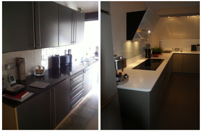
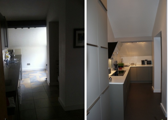
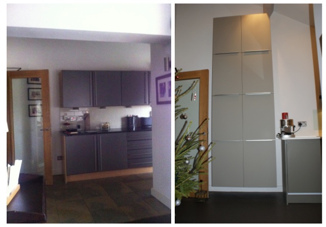
Although the current kitchen was functional, it was definitely lacking in storage space and design. The oven an hob was positioned in a small alcove with no space for working either side of it. There was a lack of cupboards and a lot of dead space at the end of the kitchen area too. Although the shape of the apartment lead the kitchen to be separate from the living area, you could see kitchen cupboards from wherever you were – leading to the feeling of one big room, rather than effective zones. (There’s lots of before and after photos down the bottom so you get the full effect. Oh and we finished this just in time for Christmas so you may spot a decoration or two in the photos!)
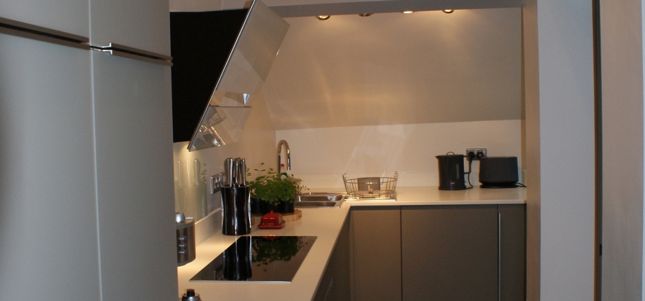
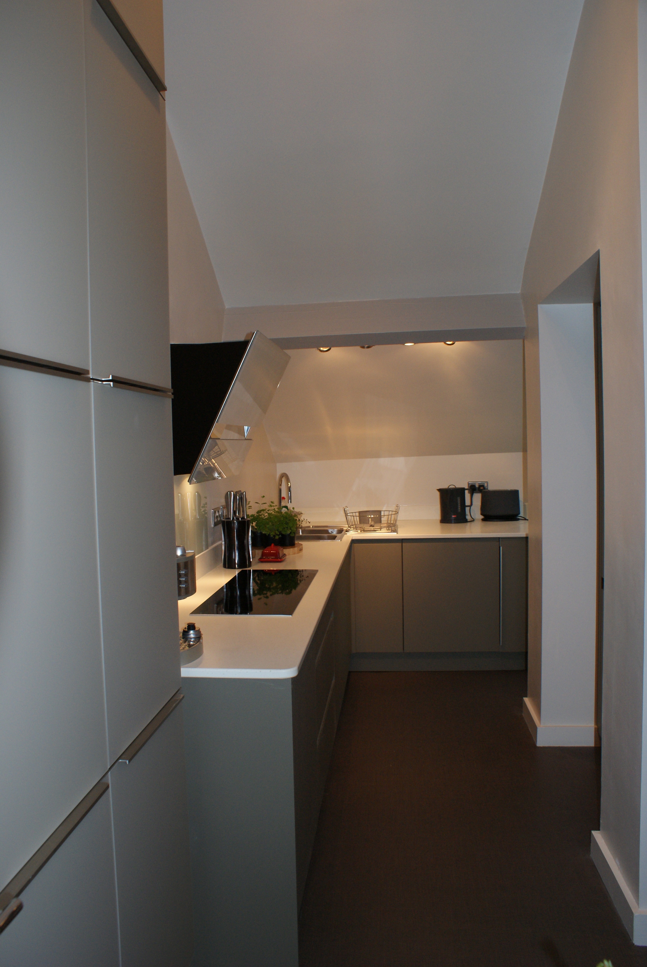
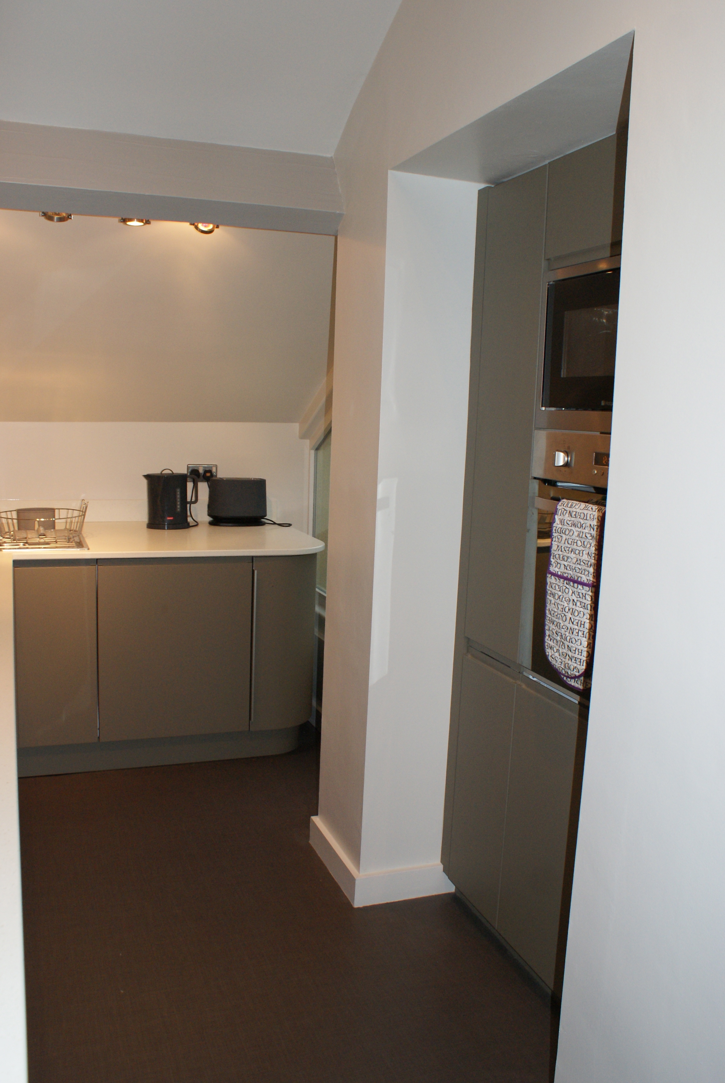
Key to our design was to bring the kitchen unit round in to an L shape so that every bit of floor space was utilised in the kitchen area. The curved units add softness to the layout and allow easy access to the corner sink. Most importantly the hob and oven was moved out of the alcove and integrated in to the long workspace so it was much more practical and conducive to cooking, with the slim induction hob helping to retain the flow of the lovely long worktop. Removing the wall units and making use of other storage solutions, such as pull out larders and clever corner cupboards, makes the kitchen space feel so much bigger and brighter.
Finally, was the style and we made use of one of Jennifer’s favourite colours, olive green, to be the focus of the kitchen, pairing it with white to retain a clean and contemporary feel.
To create a specified kitchen zone in the apartment, a large tall bank of contrasting units was used on the end where they would be visible from the lounge and dining areas. In a beautiful matt glass finish these created a wonderful statement unit and added much more storage to the kitchen, making use of the very high ceilings of the apartment.
Lounge and Dining Area
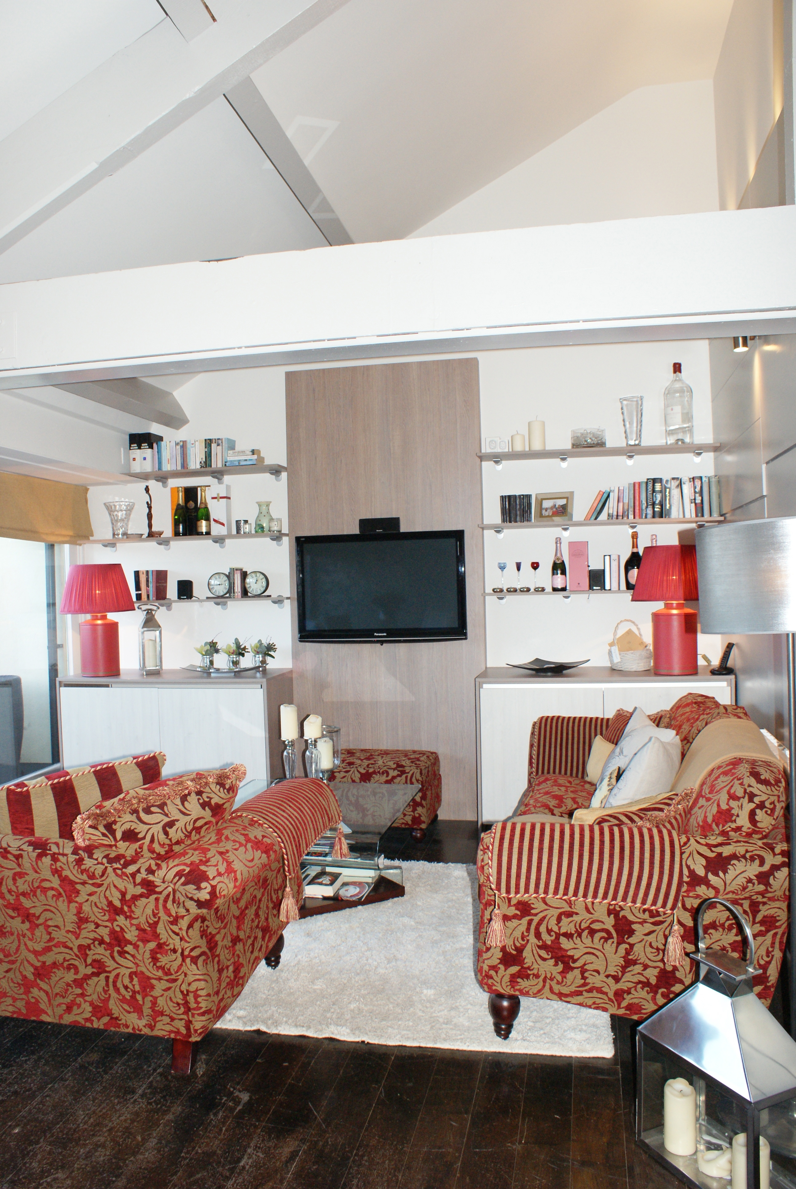
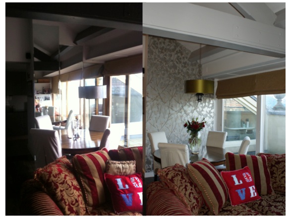
Jennifer needed much more storage space in her media unit, which was already full of lots of her books, music and accessories. This was a key element for the room as it is a main focal point. Jennifer liked the basic layout of her old media unit but wanted something that was more in keeping with the her sofa and dining table.
We used a mix of woods on the media unit to ensure both a traditional and contemporary feel. The warm tones in the central board of the TV unit add a real lived in feel to the unit, echoing the original beams found in the apartment. Mixing this with a white wood for the unit doors helped to keep the unit modern and young and the shelves gave a perfect display area for all the items that make Jennifer feel at home!
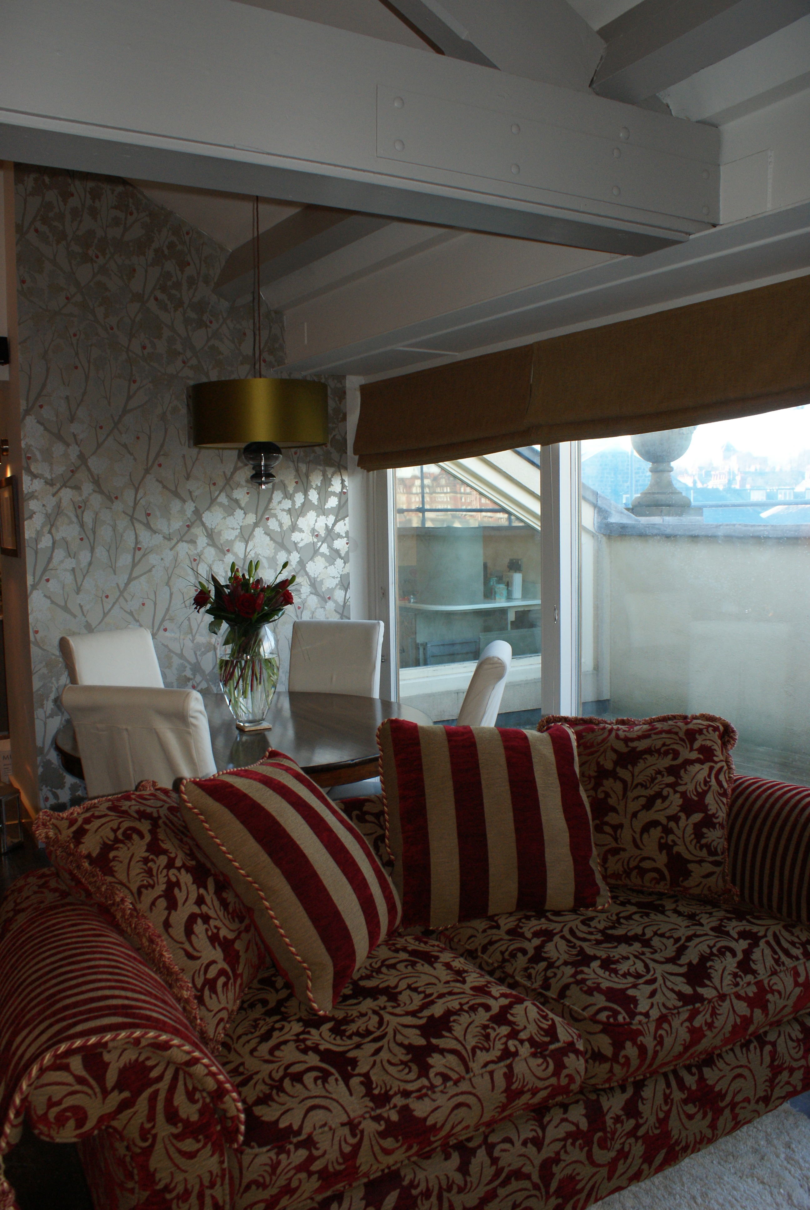
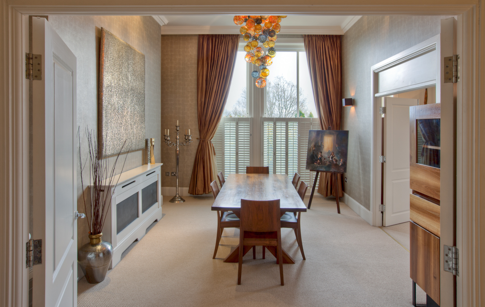
The dining area was the key link between the lounge and kitchen areas and so we used a fantastic wallpaper from Osborne and Little to bring the colours from both areas and unit the space. Definition was added with a gorgeous silk pendant light with blown glass detail, that will be wonderful when used on it’s own during dinner!
Bathroom
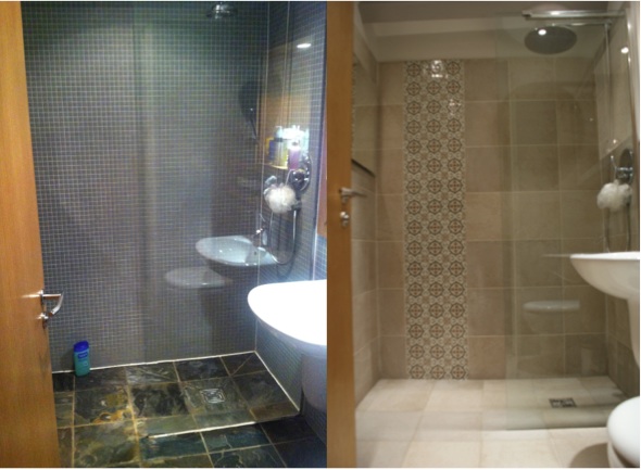
On to the last part of the project, the bathroom. Jennifer hated the dark tiles and how tired the bathroom looked. It’s important that even areas such as bathrooms continue the design from the other rooms in the home. These stunning feature tiles do just that – tying in the colours from the other rooms and continuing the look and feel we’ve achieved throughout the apartment, whilst making the en-suite feel much more spacious than before!
The icing on the cake? A text from Jennifer when she got home to say “WOW! Looks great Anna, thank you!” – confirmation she loves it as much as we do!






Comment & Share